Project 1: Data Visualization
| Power BI | PowerPoint |
A company owning multiple hotel chains was facing business challenges and sought to leverage data intelligence to drive revenue growth. I was tasked with creating a revenue dashboard displaying key performance metrics, some of which are specific to the hospitality industry.
The Business Objective:
Create a dashboard that can answer level I-III questions, allowing upper management to make strategic decisions faster. The revenue dashboard must provide surface-level overviews with the capability to drill down dynamically.
The Data:
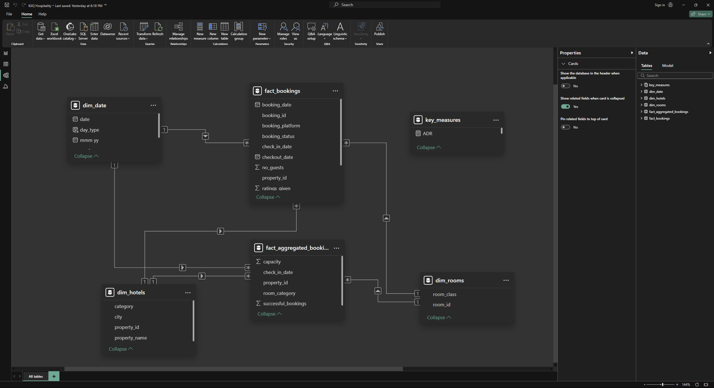
The data I was given came in 5 separate databases: 3-dimensional tables and 2 fact tables, a star schema.
The 3 dimension tables include:
Dates: Indicating days of the week, along with week numbers of all dates in the sample data. It’s to be noted that hotels consider weekdays Sunday-Thursday, and Weekends are Friday-Saturday.
Hotels: Shows the various properties and their IDs, and whether they’re a “business” or “luxury” hotel.
Rooms: Shows the different room types
The 2 fact tables:
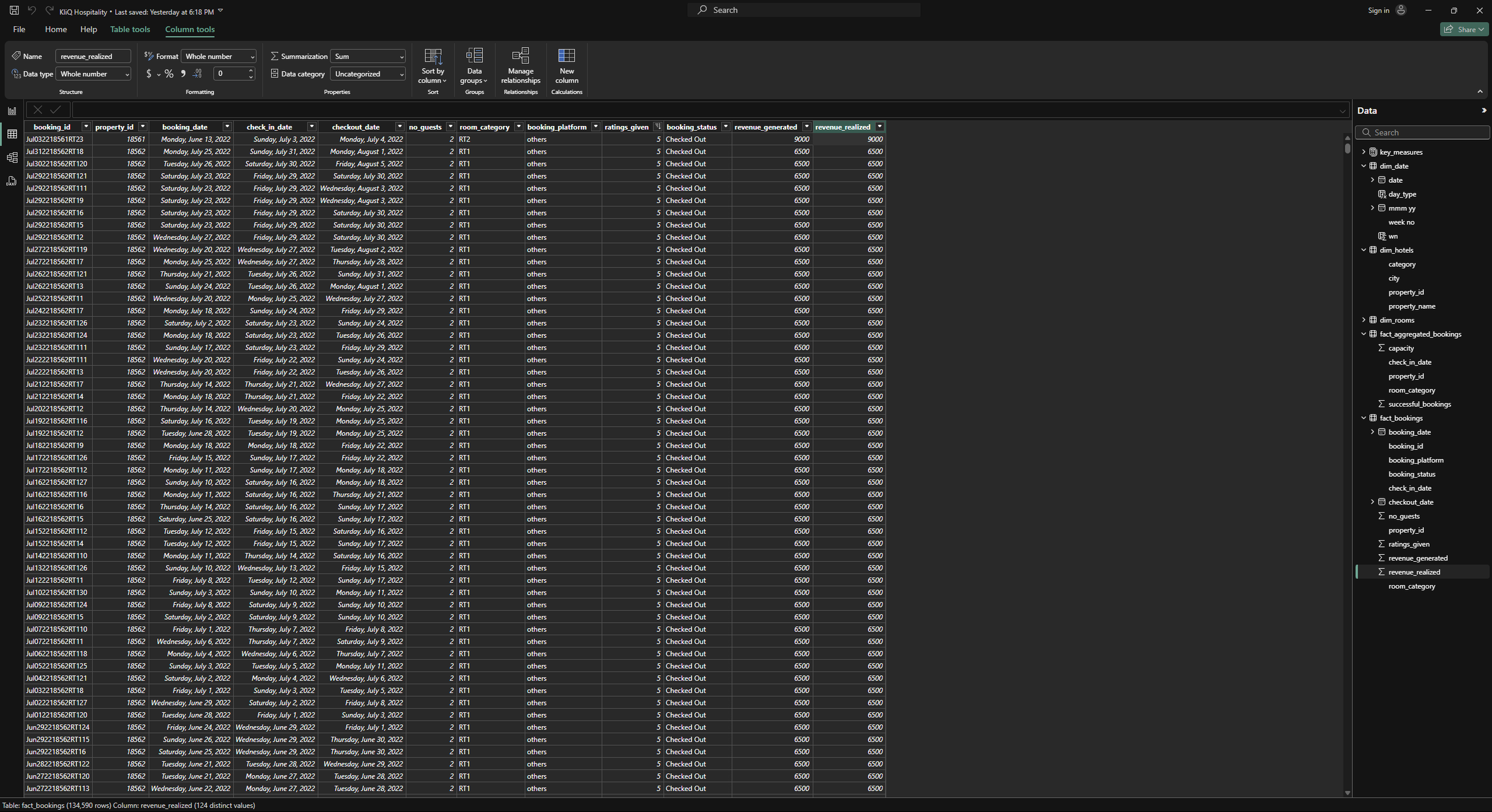
Bookings: Displayed records of each booking, its status, check-in, and check-out dates.
Aggregated Bookings: Combined all the data per hotel property.
Cleaning:
I inserted the data into Power Query to clean up the tables and to create some calculated fields. Most notably, I made a “Capacity” dimension within the aggregate bookings fact table, which took the total rooms per property and subtracted out the rooms unavailable due to maintenance and other issues.
Relationships:
Next, I created the relationships within the data utilizing Power Pivot, setting up the star schema. These relationships allow for the data to have granular and dynamic relationships when filtering, which will be useful for drilling down into the data.
KPIs:
To prepare for the dashboard creation, I had to put on my mathematician hat and pour a cup of coffee. The client wanted some industry-specific key performance indicators including (with DAX format):
ADR (Average Daily Rate): Essentially, the average price for a room. = Revenue / Total Bookings
ADR = DIVIDE([Revenue], [Total Bookings], 0)Revenue = Sum of revenue_realized from Booking table (in Rs)
Revenue = SUM(fact_bookings[revenue_realized])Total bookings = Count of booking_id from Bookings table
Total Bookings = COUNT(fact_bookings[booking_id])Avg rating = Average of ratings from Bookings table
Average Rating = AVERAGE(fact_bookings[ratings_given])Total Capacity = Sum of capacity on Aggregated Bookings table
Total Capacity = SUM(fact_aggregated_bookings[capacity])Occupancy rate = Total successful bookings / Capacity
Occupancy % = DIVIDE([Total Successful Bookings], [Total Capacity], 0)Total successful bookings = Sum of successful bookings from Agg. Bookings table
Total Successful Bookings = SUM(fact_aggregated_bookings[successful_bookings])Total cancelled bookings = Count of cancelled bookings from Bookings table
Total Cancelled Bookings = CALCULATE([Total Bookings],fact_bookings[booking_status]="Cancelled")Cancellation rate = Total cancelled bookings / Total bookings
Cancellation % = DIVIDE([Total Cancelled Bookings], [Total Bookings])DSRN (Daily Sellable Room Nights) = Total Capacity / # of days
DSRN = DIVIDE([Total Capacity], [No of days])Then I did the Week/Week % change for all of the most important KPIs
Occupancy WoW change % =
Var selv = IF(HASONEFILTER(dim_date[wn]),SELECTEDVALUE(dim_date[wn]),MAX(dim_date[wn]))
var revcw = CALCULATE([Occupancy %],dim_date[wn]= selv)
var revpw =  CALCULATE([Occupancy %],FILTER(ALL(dim_date),dim_date[wn]= selv-1))

return


DIVIDE(revcw,revpw,0)-1
ADR WoW change % =
Var selv = IF(HASONEFILTER(dim_date[wn]),SELECTEDVALUE(dim_date[wn]),MAX(dim_date[wn]))
var revcw = CALCULATE([ADR],dim_date[wn]= selv)
var revpw = CALCULATE([ADR],FILTER(ALL(dim_date),dim_date[wn]= selv-1))
return
DIVIDE(revcw,revpw,0)-1Revenue WoW change % =
Var selv = IF(HASONEFILTER(dim_date[wn]),SELECTEDVALUE(dim_date[wn]),MAX(dim_date[wn]))
var revcw = CALCULATE([Revenue],dim_date[wn]= selv)
var revpw = CALCULATE([Revenue],FILTER(ALL(dim_date),dim_date[wn]= selv-1))
return
DIVIDE(revcw,revpw,0)-1Revpar WoW change % =
Var selv = IF(HASONEFILTER(dim_date[wn]),SELECTEDVALUE(dim_date[wn]),MAX(dim_date[wn]))
var revcw = CALCULATE([RevPAR],dim_date[wn]= selv)
var revpw = CALCULATE([RevPAR],FILTER(ALL(dim_date),dim_date[wn]= selv-1))
return
DIVIDE(revcw,revpw,0)-1The Dashboard:
After the KPIs were made, I started designing the revenue dashboard for AtliQ. The CEO specifically asked for a couple of views to incorporate, so I started with those. The required specifications included:
It needs to provide an overview of all KPIs
Suitable for the C-suite and analysts - ability to drill down
Obtain key information within seconds of viewing
Ability to filter content
Data should be interactive in nature
With these requirements in mind, I included the following features within the dashboard:
Filter by City
Filter by Room Type
Filter by Status
Filter by Property Chain
Filter by Month and Week
Statcard with all KPIs and their week-over-week change
KPIs split by weekday vs weekend
Realization% and ADR by platform
ADR, RevPar, and Occupancy% over time
Doughnut chart of % of Revenue by Hotel Category
Pie chart depicting % of Bookings by Status
Bar chart indicating Revenue by Booking Platform
Scatterplot showing the correlation between the Average Rating and Occupancy% by Property
A table with a comprehensive overview of KPIs per property
All stats have tooltips on hover and are interactive in nature
Dashboard colors derived from the company logo
These features enable C-Suite executives to obtain overviews of KPIs at a glance, while maintaining the option to view data on a granular basis.

Business Outcomes and Insights:
Mumbai generates the highest revenue, and Delhi the least revenue during May-Jul 2022. Company needs to focus on increasing revenue within Delhi.
Contrastingly, Delhi consistently has a higher occupancy % than any other city, indicating either the need for another property or increase in prices.
The ADR is the same for Weekdays and Weekends, indicating no price discrimination. This indicates a massive opportunity for the company to leave less Rupees on the table.
61.6% of revenue comes from Luxury Hotels as opposed to 38.4% from Business Hotels.
There is a strong correlation between Occupancy % and Average Reviews.
"AtliQ Blu" property chain consistently has the highest reviews while the "AtliQ Seasons" chain has the lowest reviews. The company is advised to compare and contrast the experience of the two chains or do a corporate injection from other locations to revitalize the culture. Not only does Atliq Seasons have the lowest reviews, but it also has the highest ADR, indicating it's price is too high for it's current value proposition.
Since occupancy rate correlates greatly to both revenue and ratings, this suggests the company should prioritize ratings, collecting and implementing feedback.
Conclusion:
The revenue dashboard was catered to the needs of the business and, as a result, provided significant value to the company. The inclusion of relevant filters, KPIs, intractability, and tooltips provided a helping hand in uncovering areas of opportunity. With the insights gained, AtliQ Hotels understands where they are and where they want to go, providing the ability to set goals with clarity, and act on them with direction and magnitude.